A complete identity, built around one letterform.
Kaffa is a coffee, brunch & wine bar on the Douro Marina in Afurada, Vila Nova de Gaia. The identity covers the full system — logo, colour, typography, pattern — carried through every real touchpoint: signage, social, tableware, loyalty, merchandise, and print.
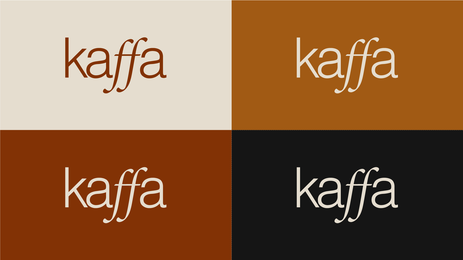
Two marks, one system
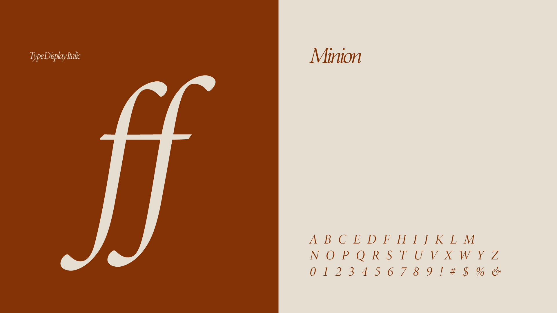
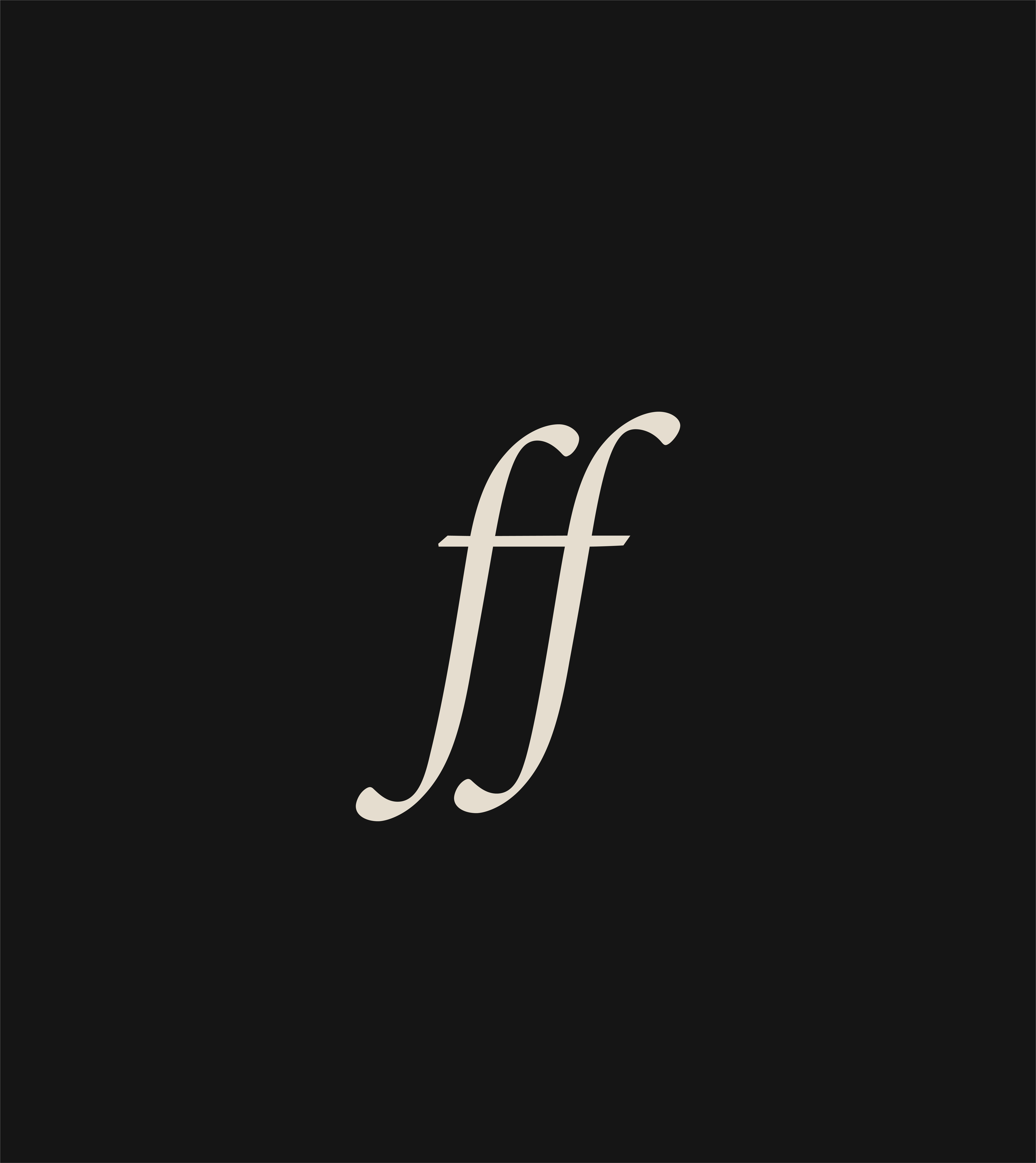
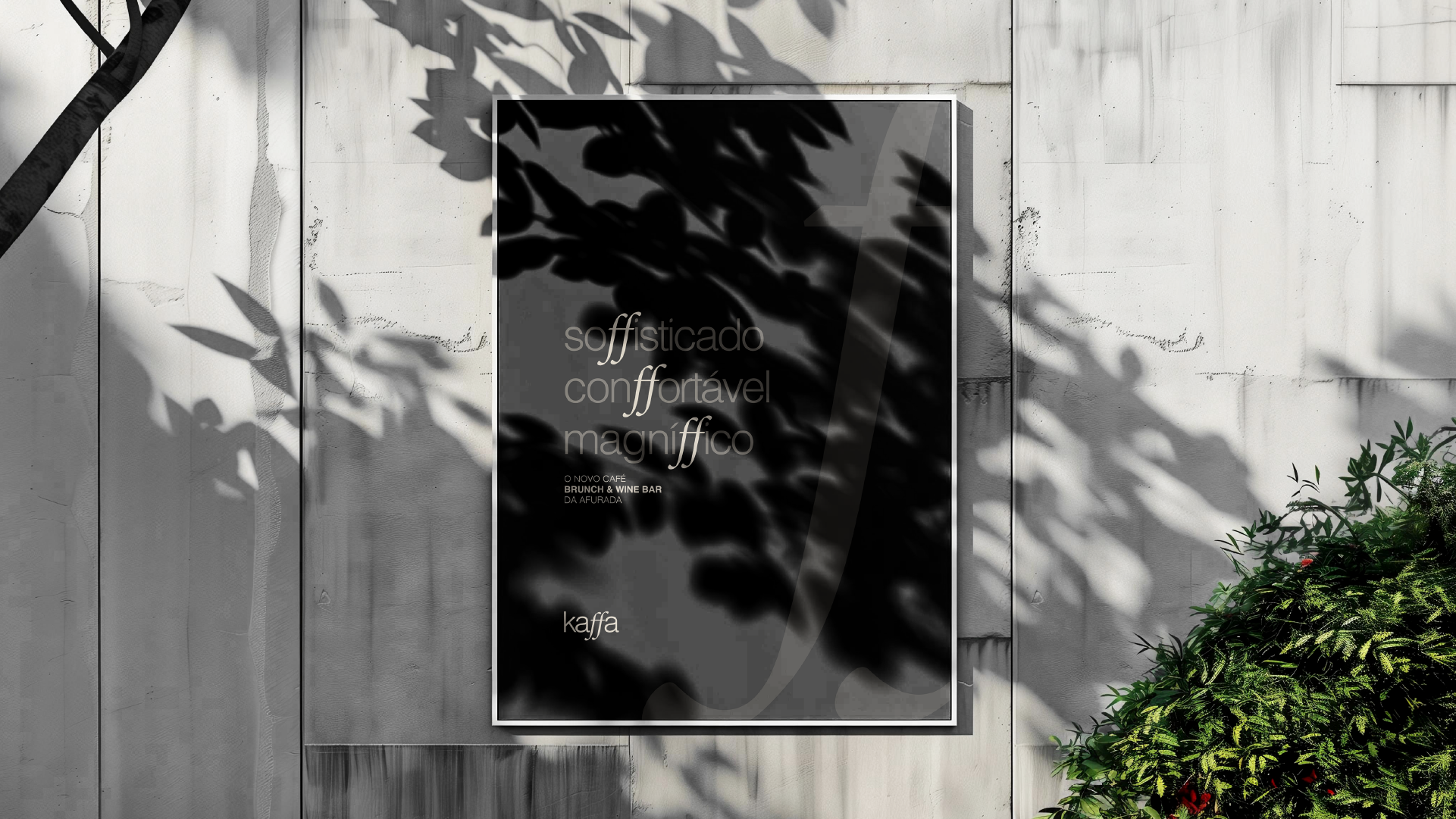
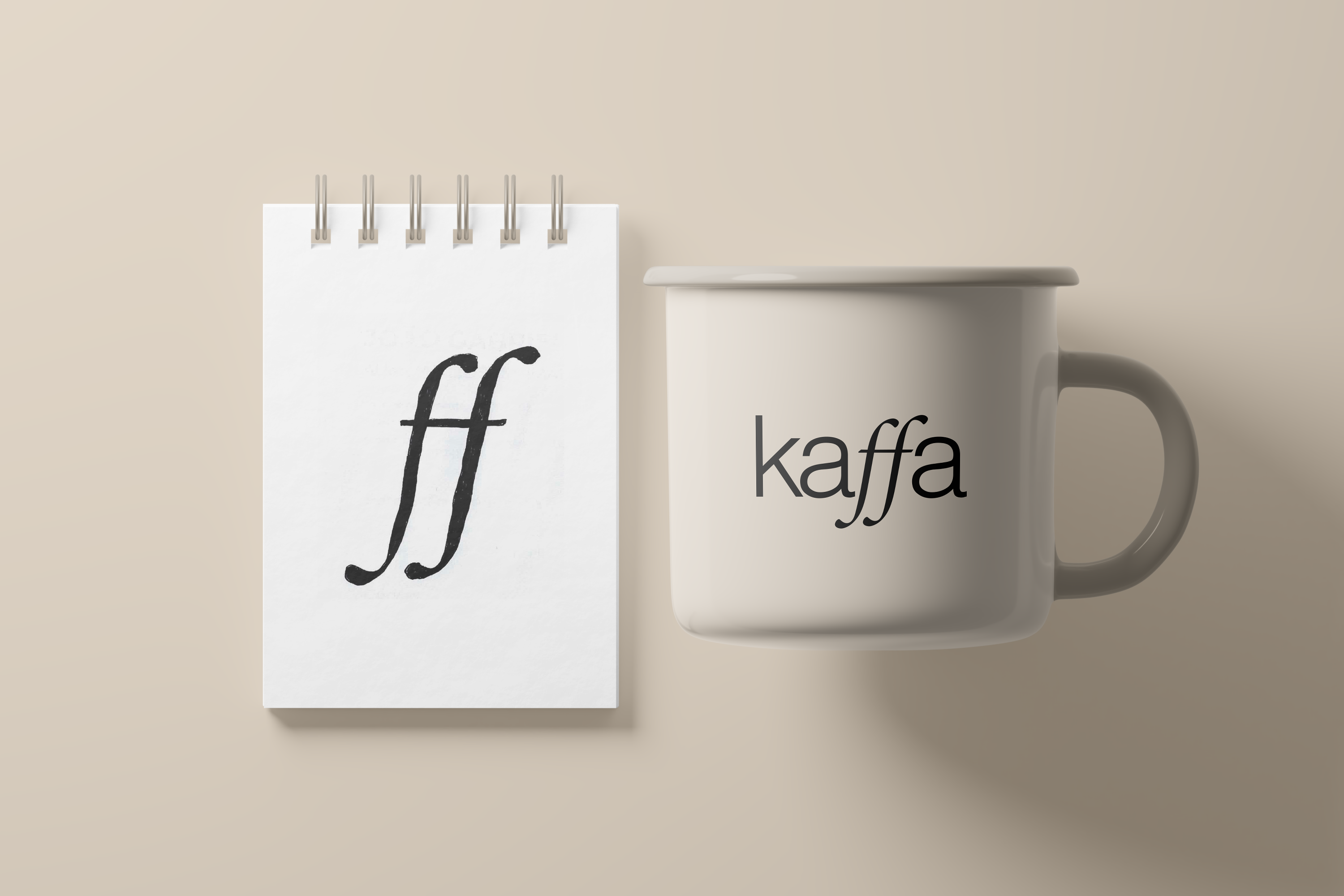
The lowercase "k" carries the structure; the italic double-f carries the personality — the detail every other application comes back to.
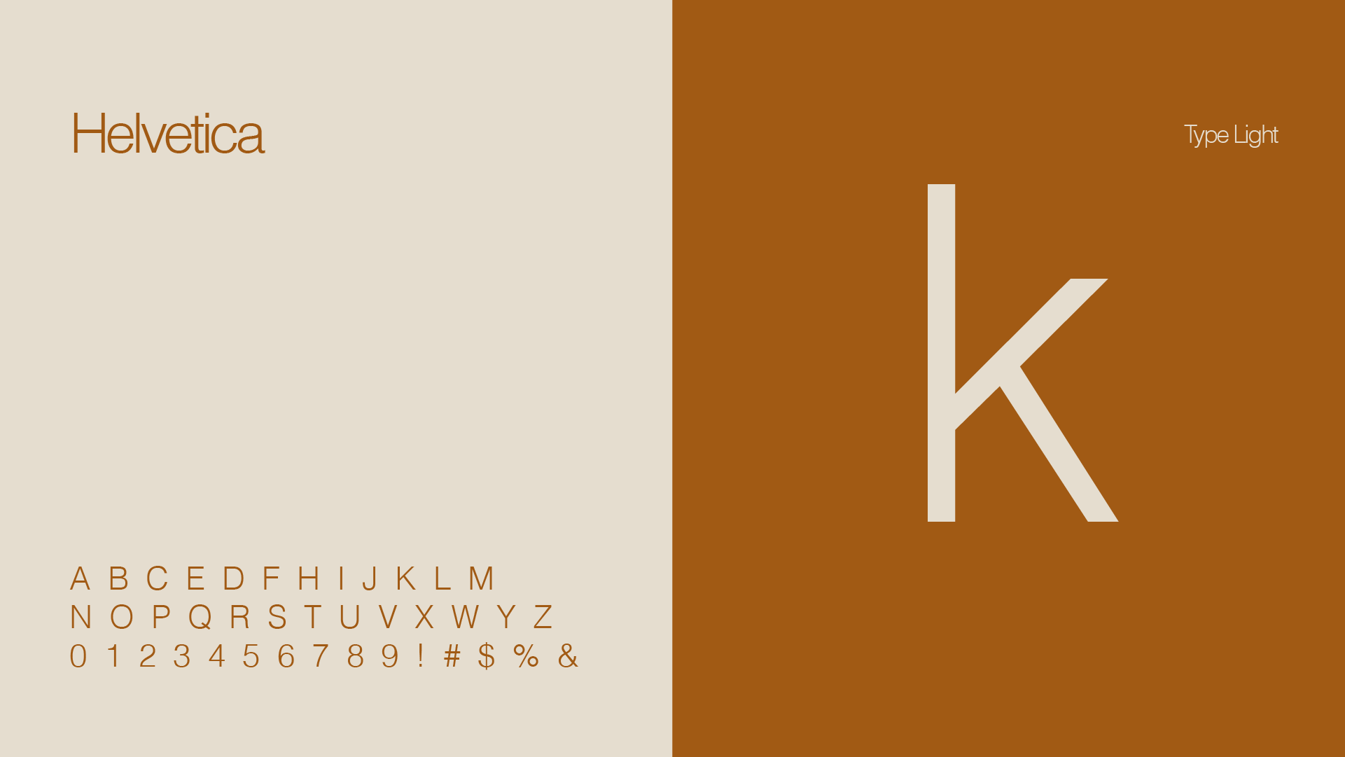
The typography, put to work
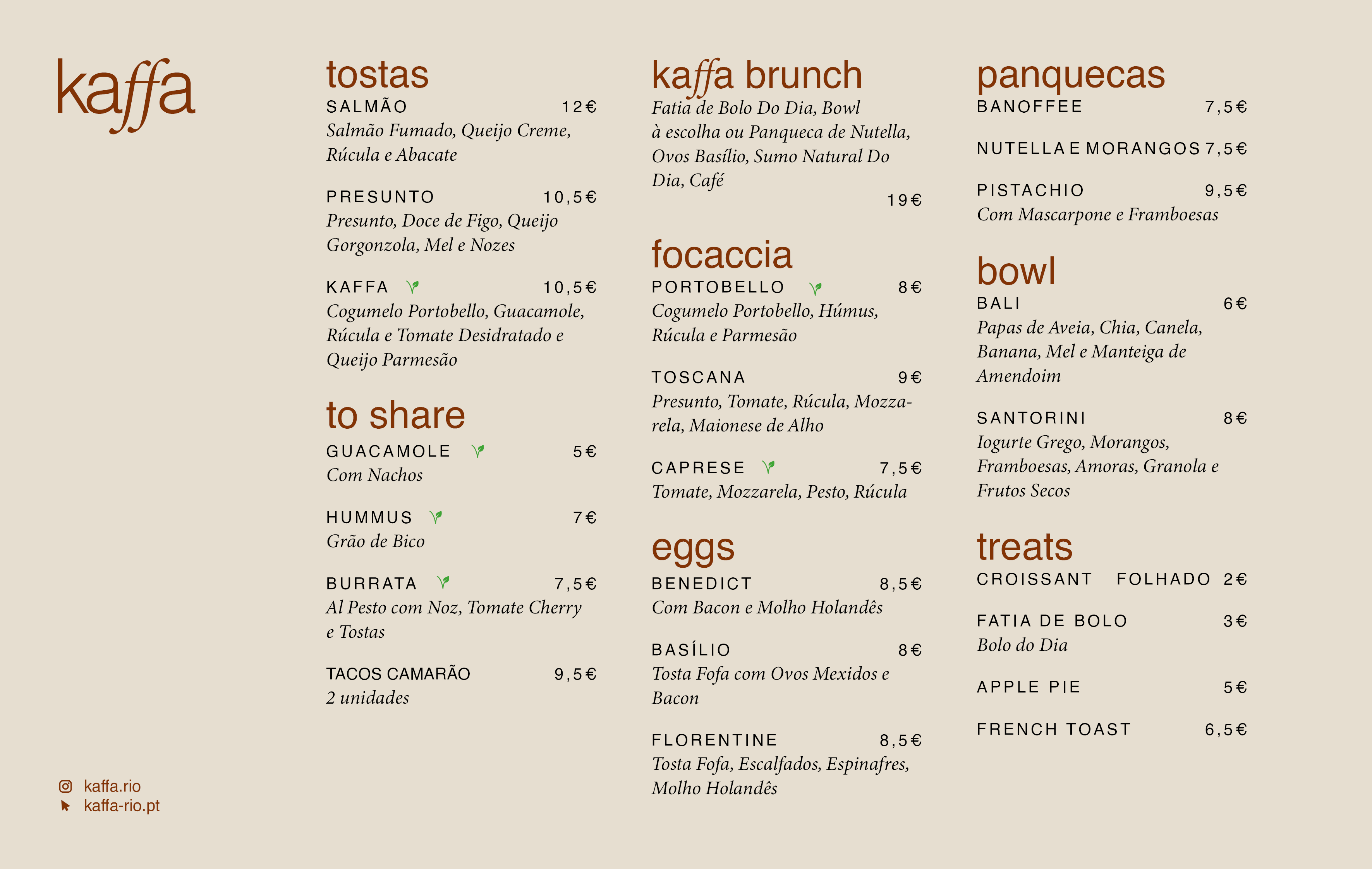
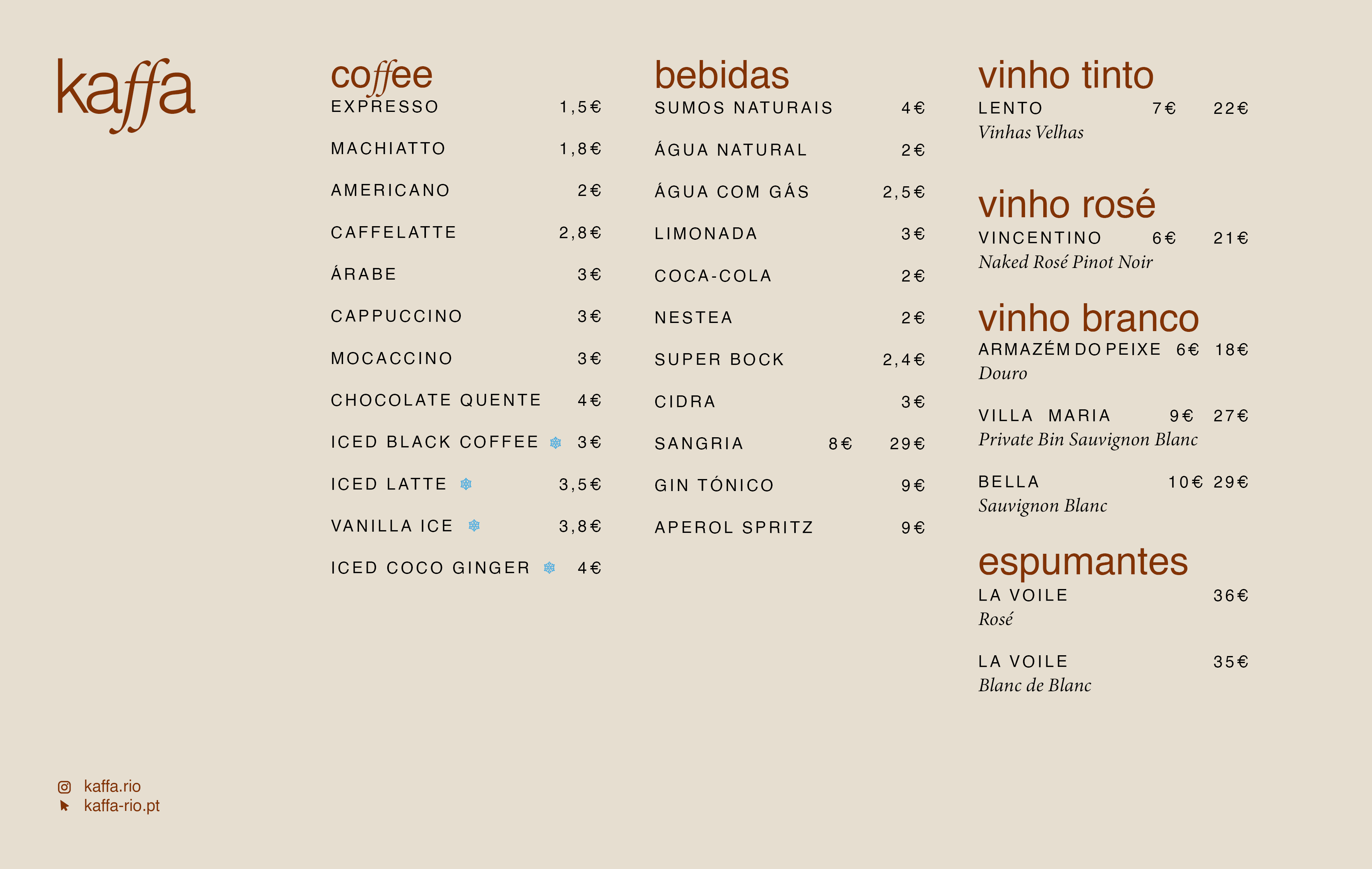
Where the type system earns its keep — set as an actual menu, not just a specimen.
Warm, roasted, grounded
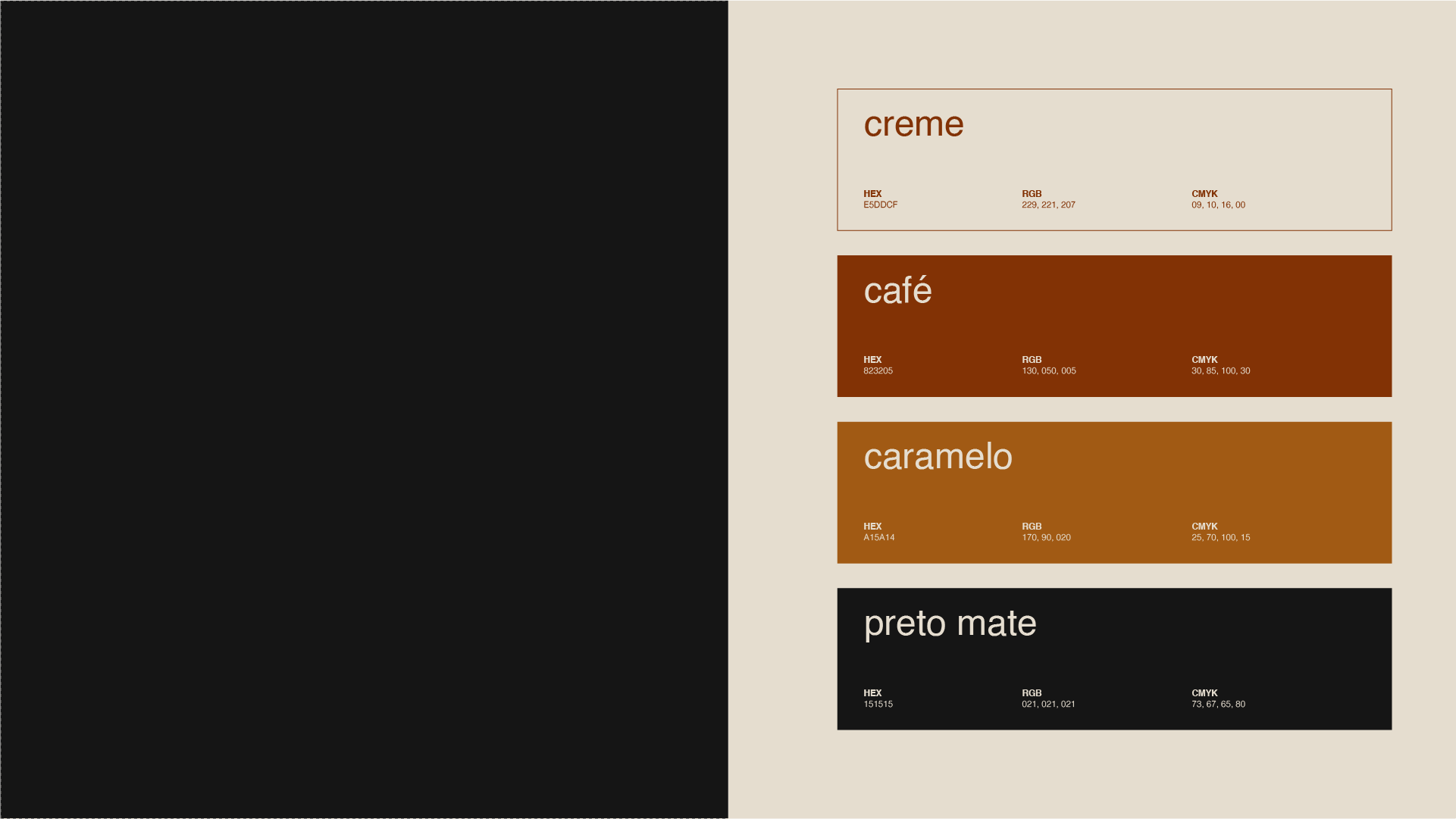
The core palette, and the tonal variations it opens up across applications.
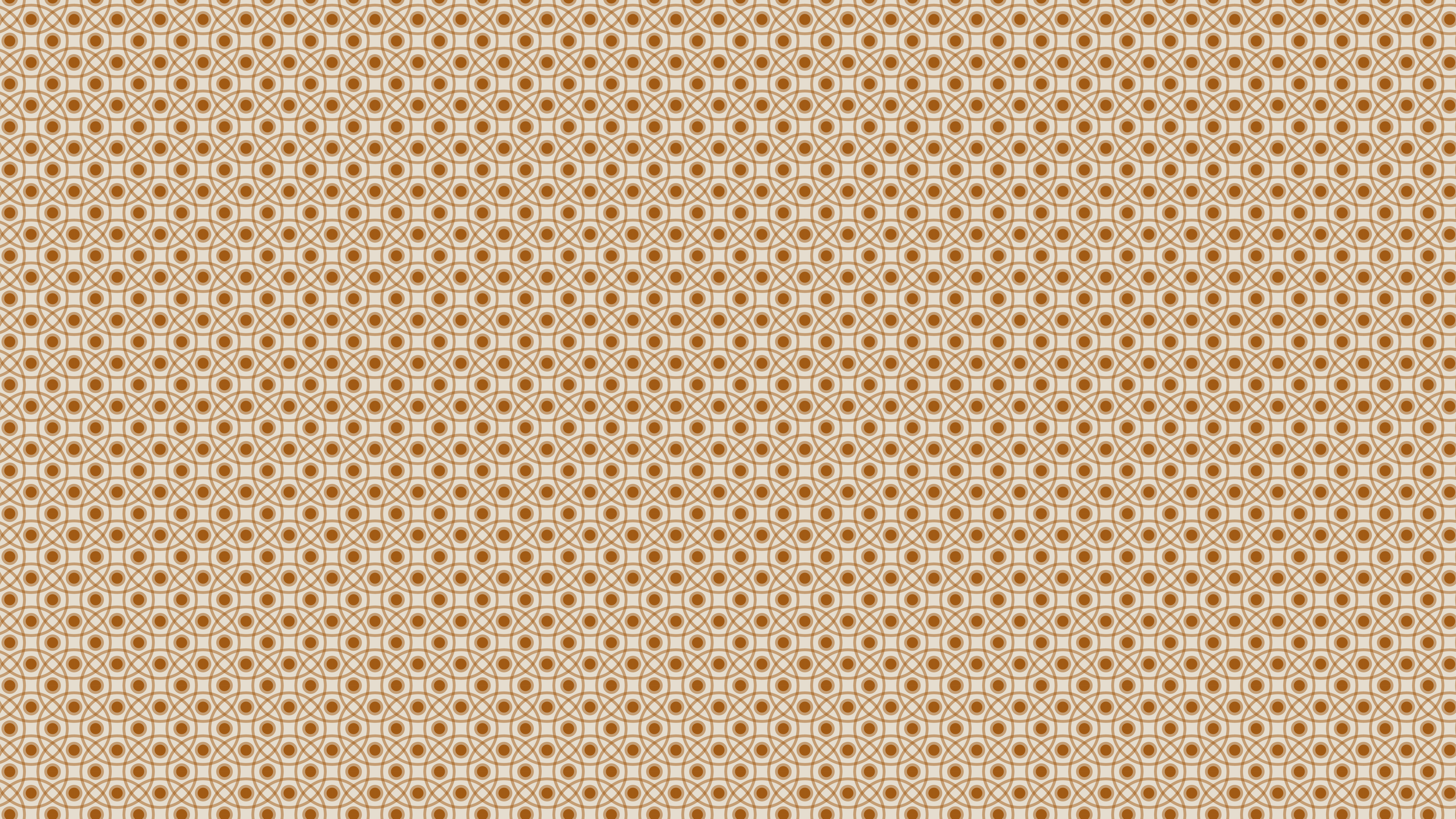
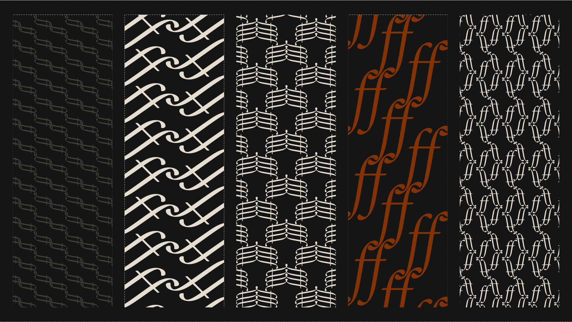
Repeat patterns, built from the mark
Favicon, profile, and feed
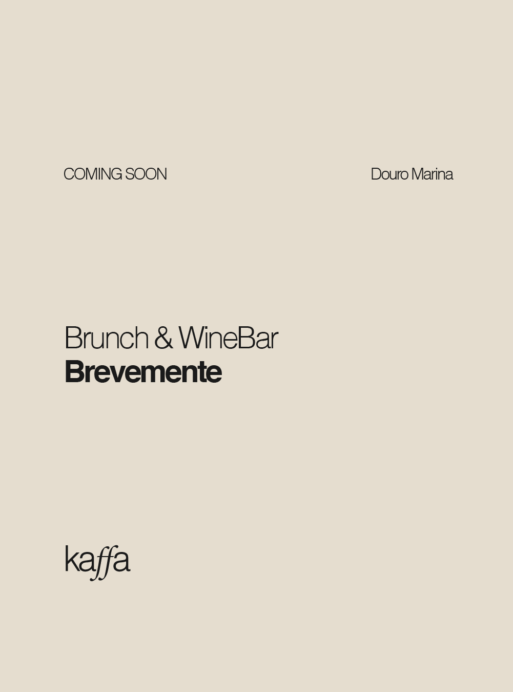
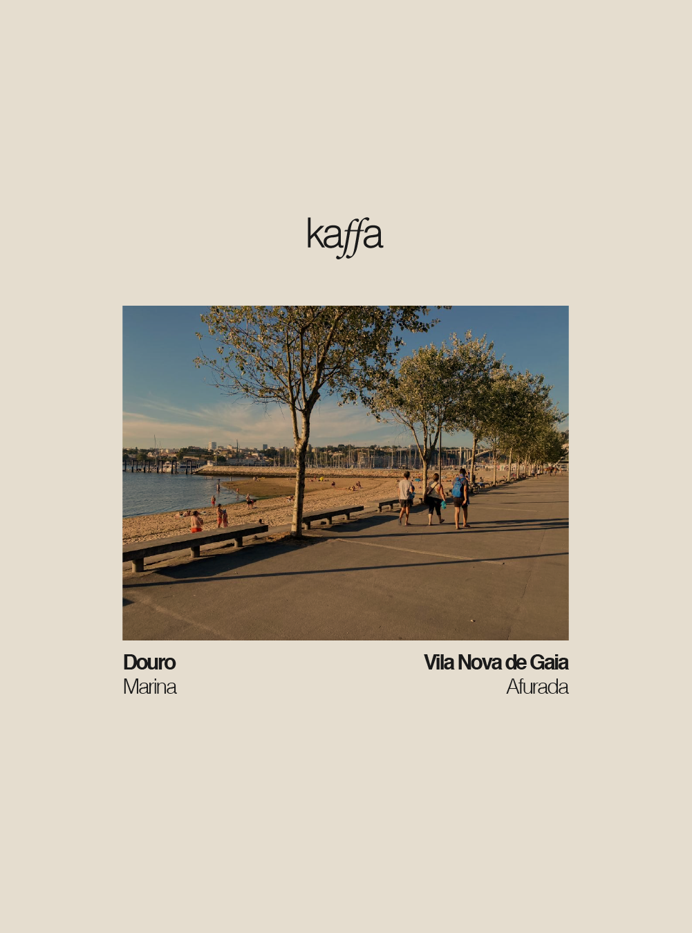
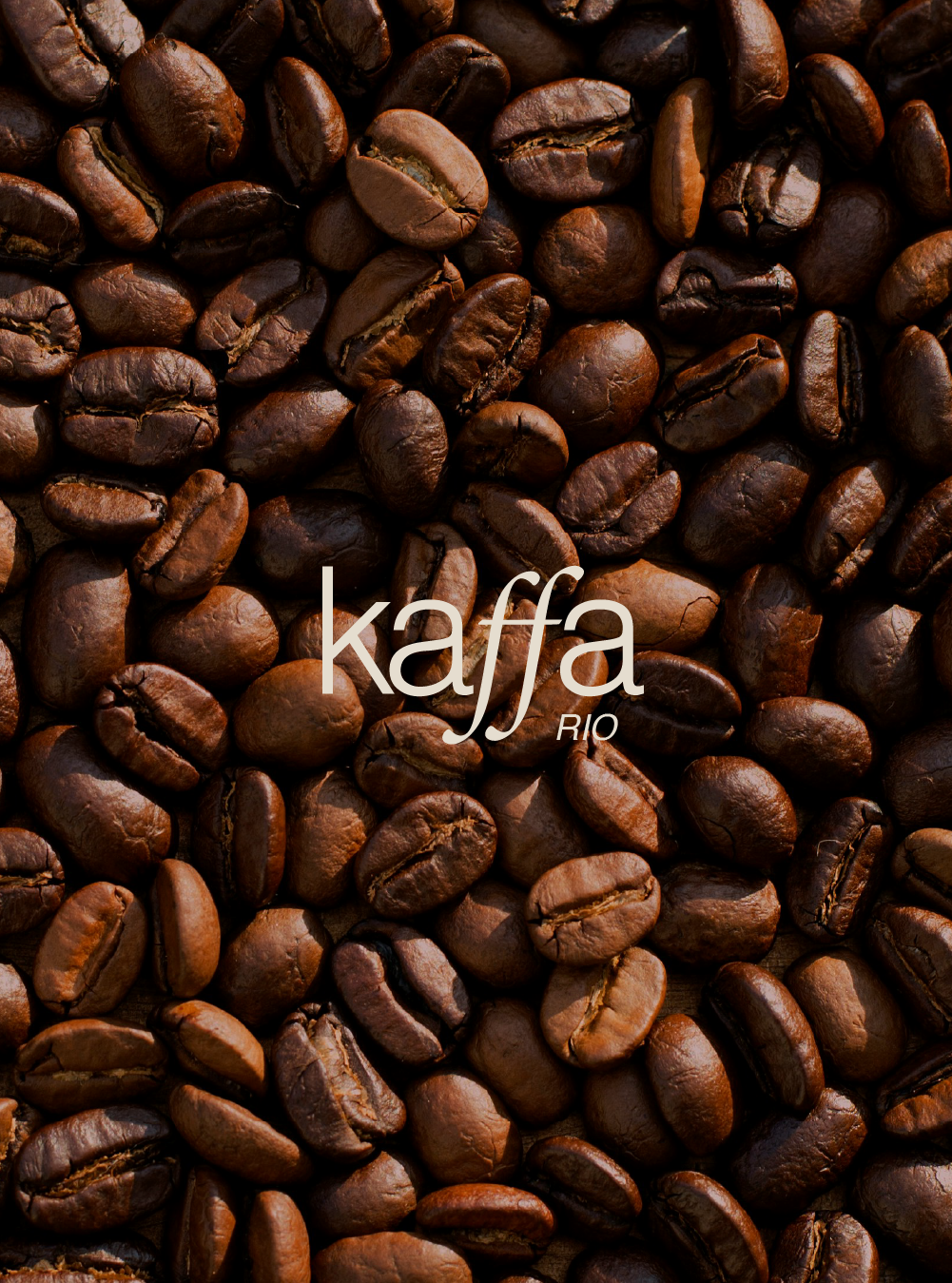
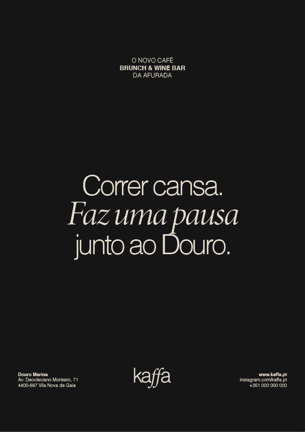
Banners for runners who cross by the place
Kaffa sits right along the Douro riverside running path. The message: "Running is tiring. Have a break by the Douro River."
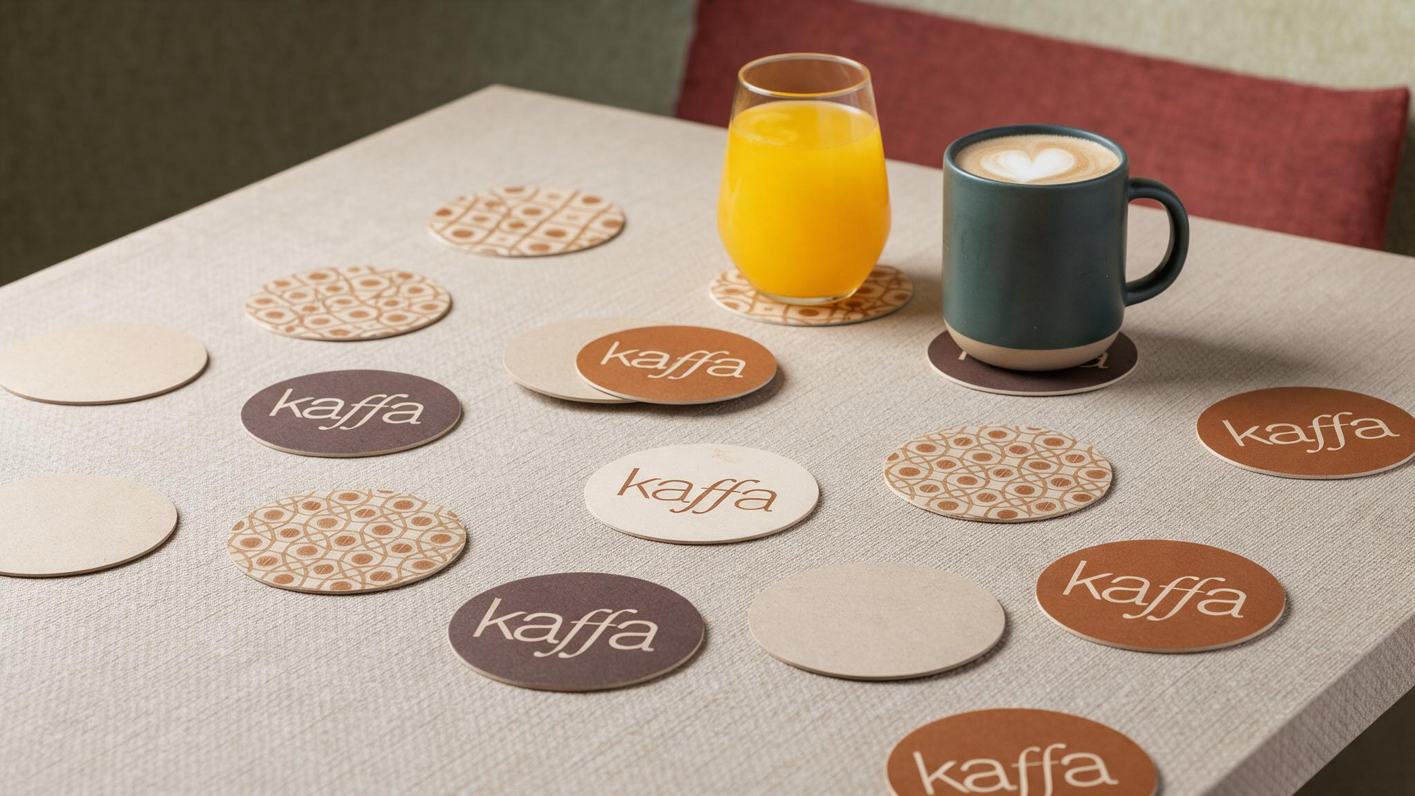
Coasters, cycling the mark and the palette
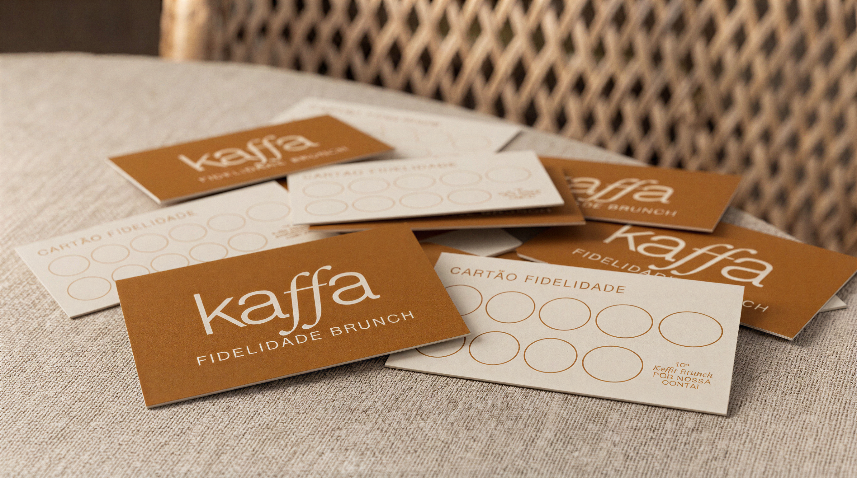
Loyalty card, front and back
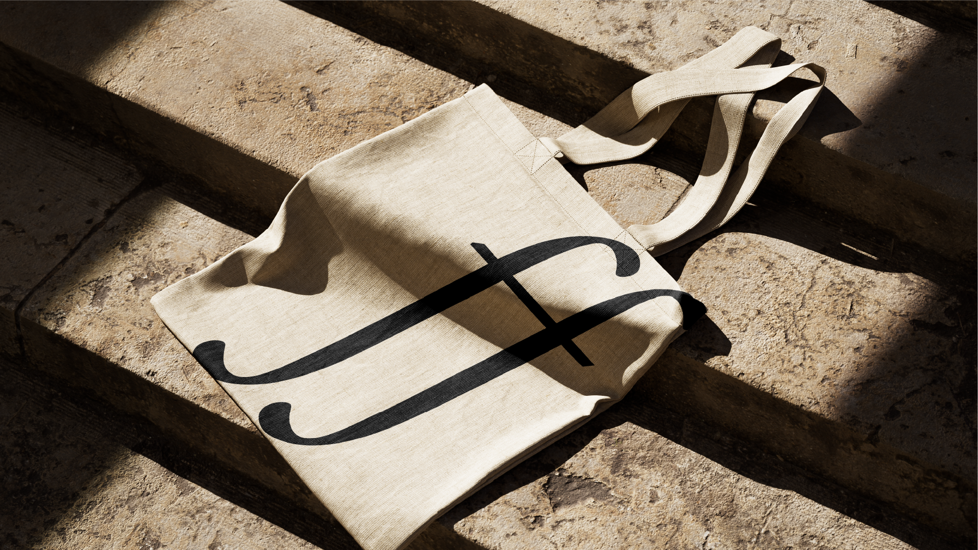
Tote bag, mug & notepad
Photography by Eduardo Almeida
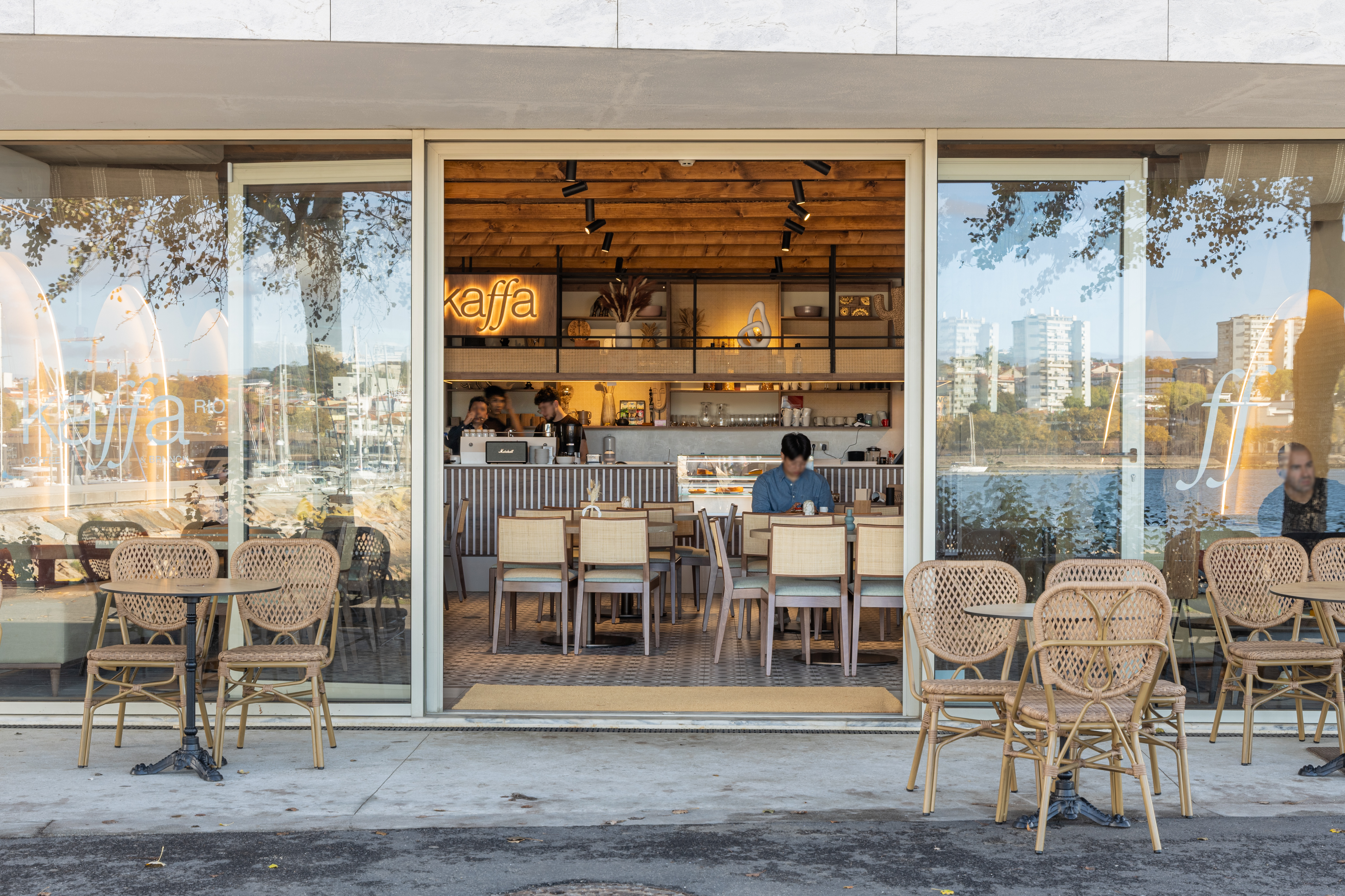
The identity applied throughout the space — food, staff, storefront and interior. This shoot was a collaboration, produced under my creative direction.
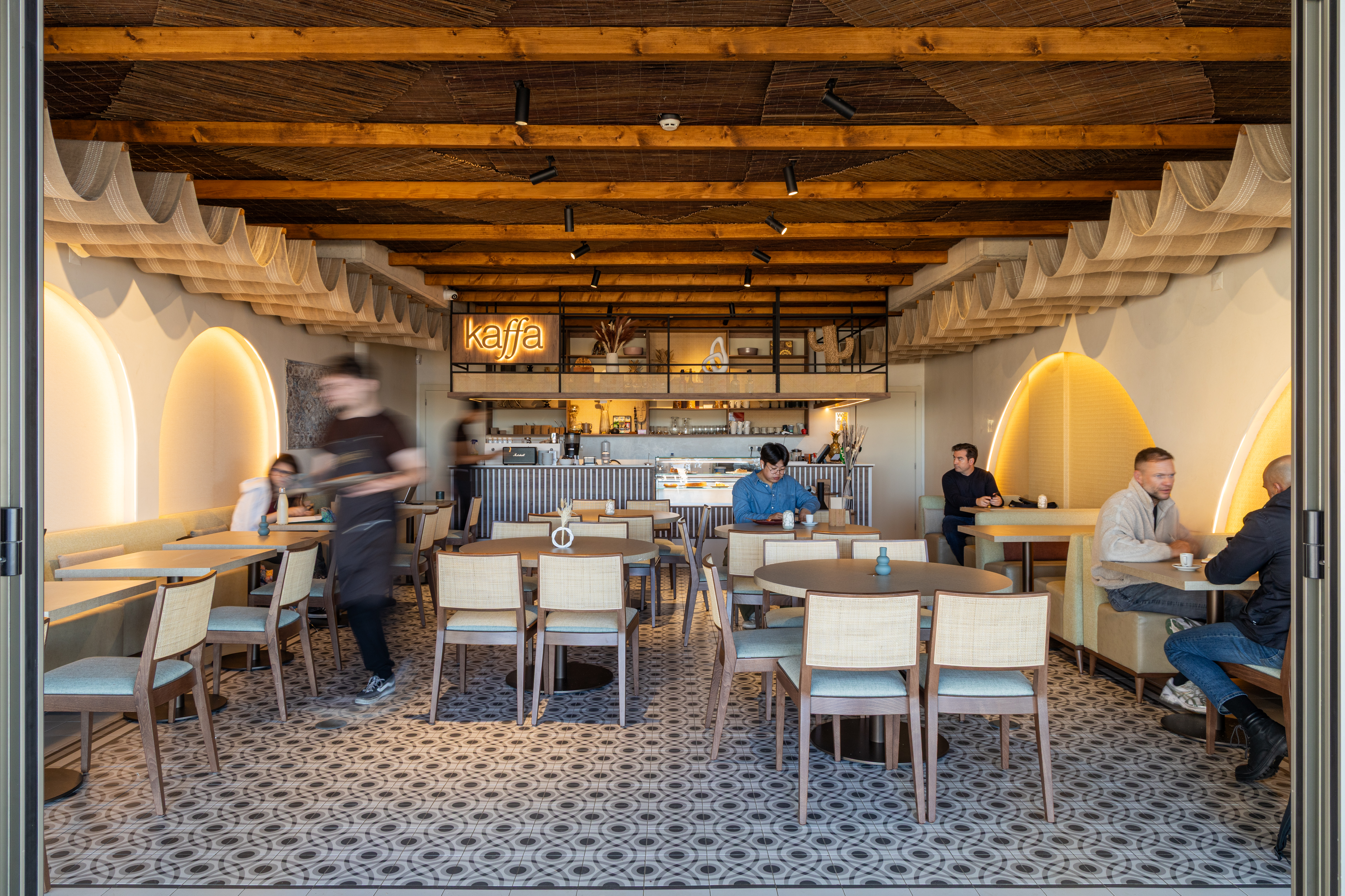

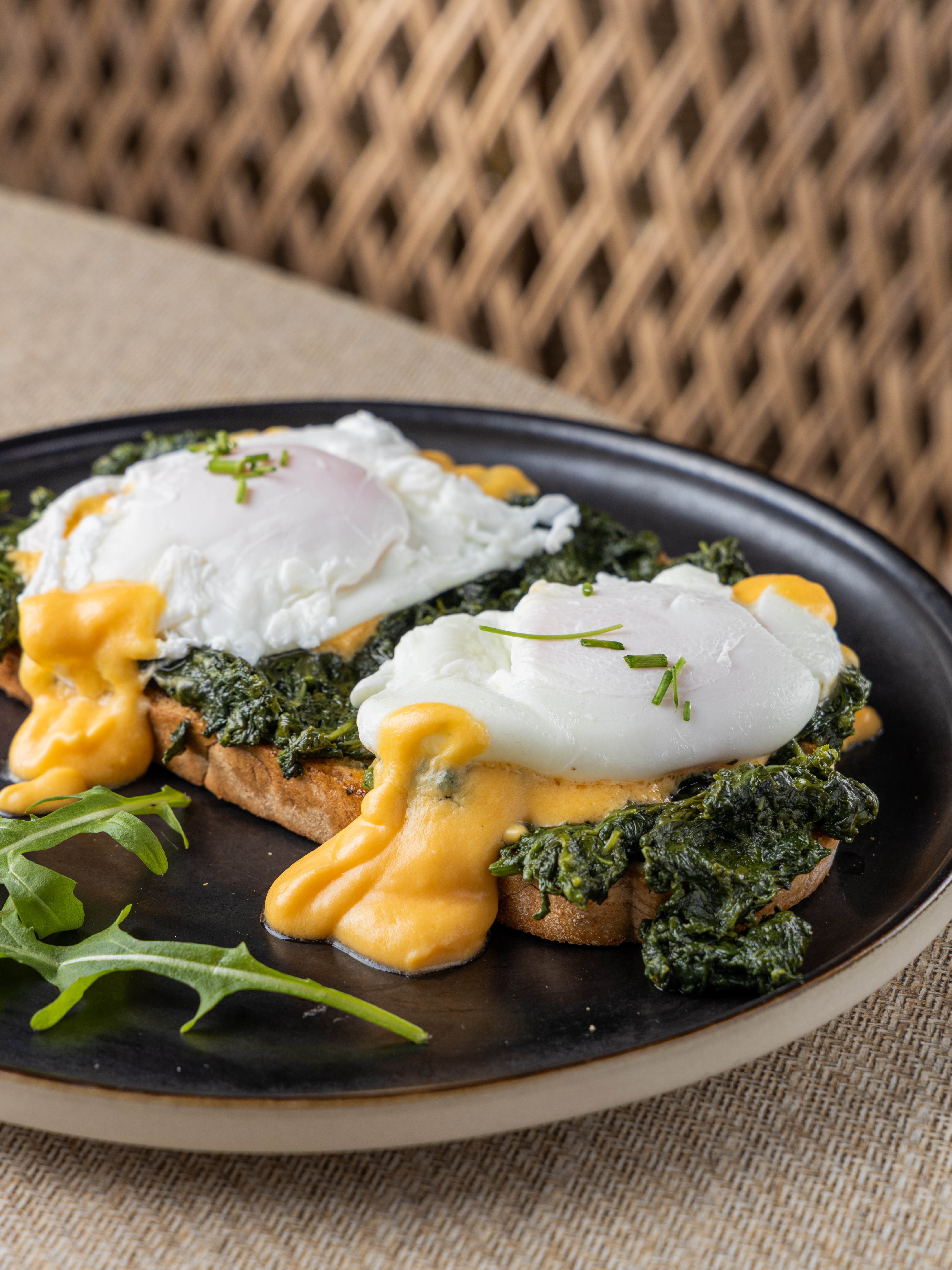


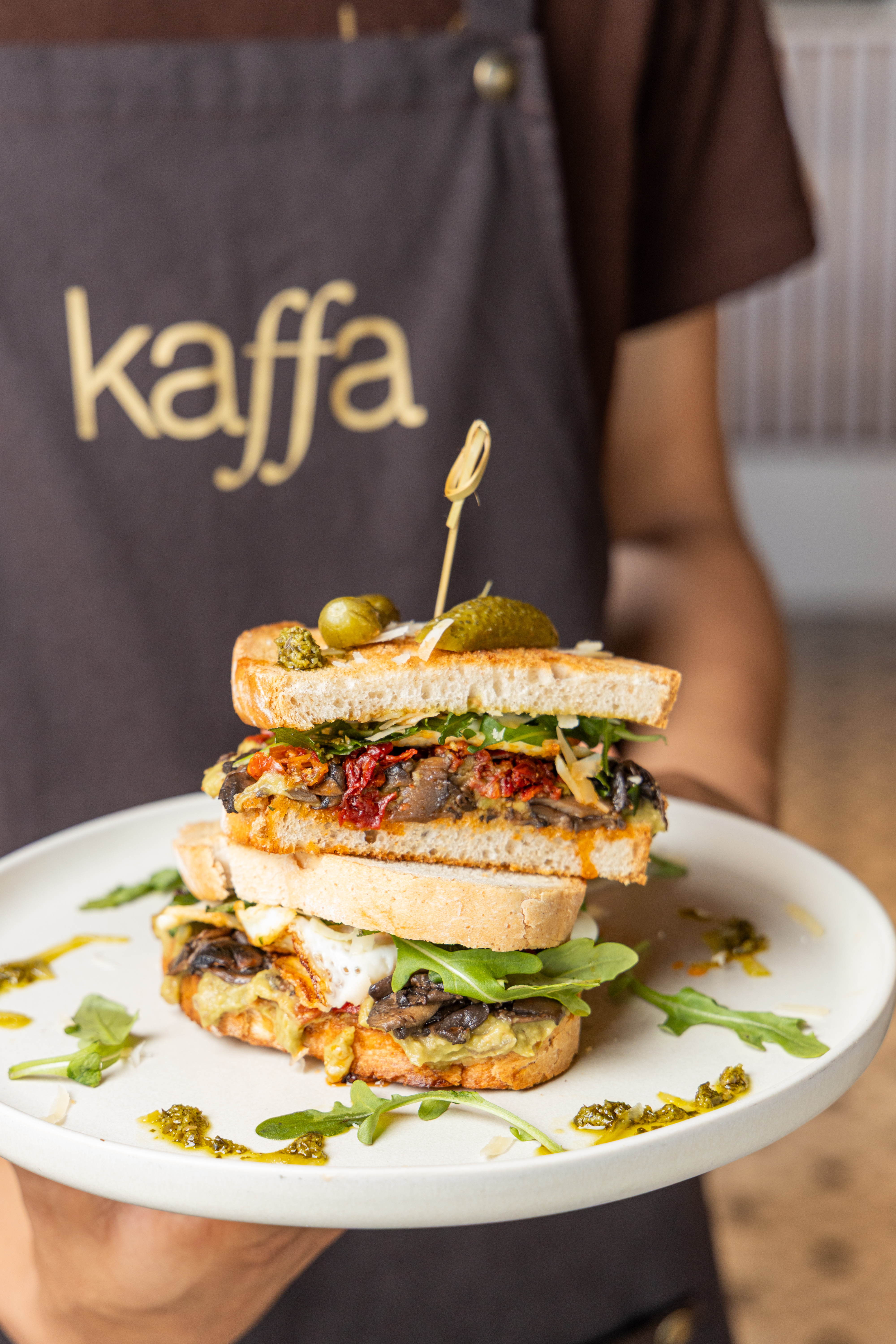
This project is the clearest proof I have of a full identity system held together end to end — a typographic and colour system carried through pattern, tableware, loyalty, merchandise, social and print, verified against real photography rather than mockups alone. It's the same discipline I bring to any brand: make one small detail — a ligature, a colour value — do structural work across everything the brand touches.