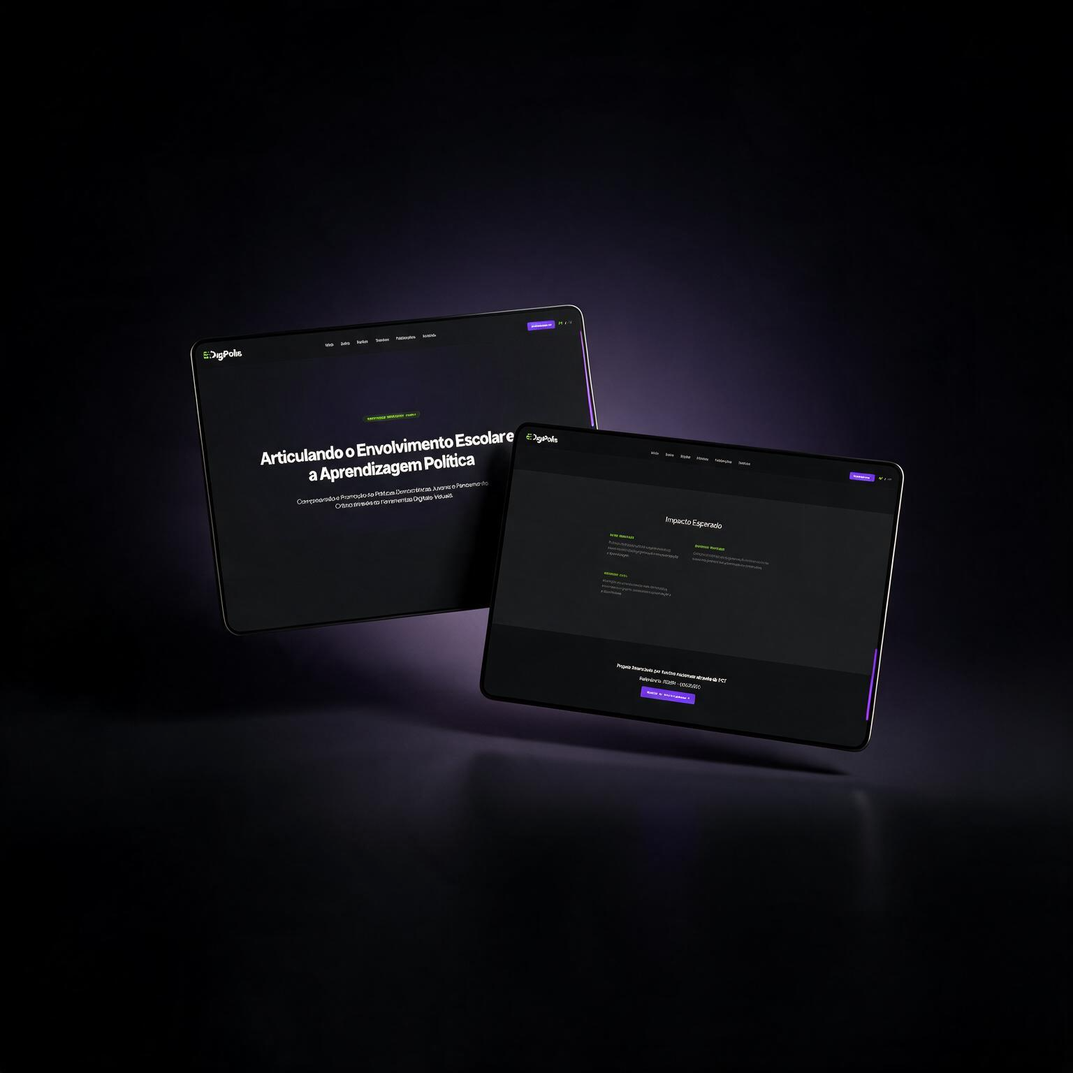
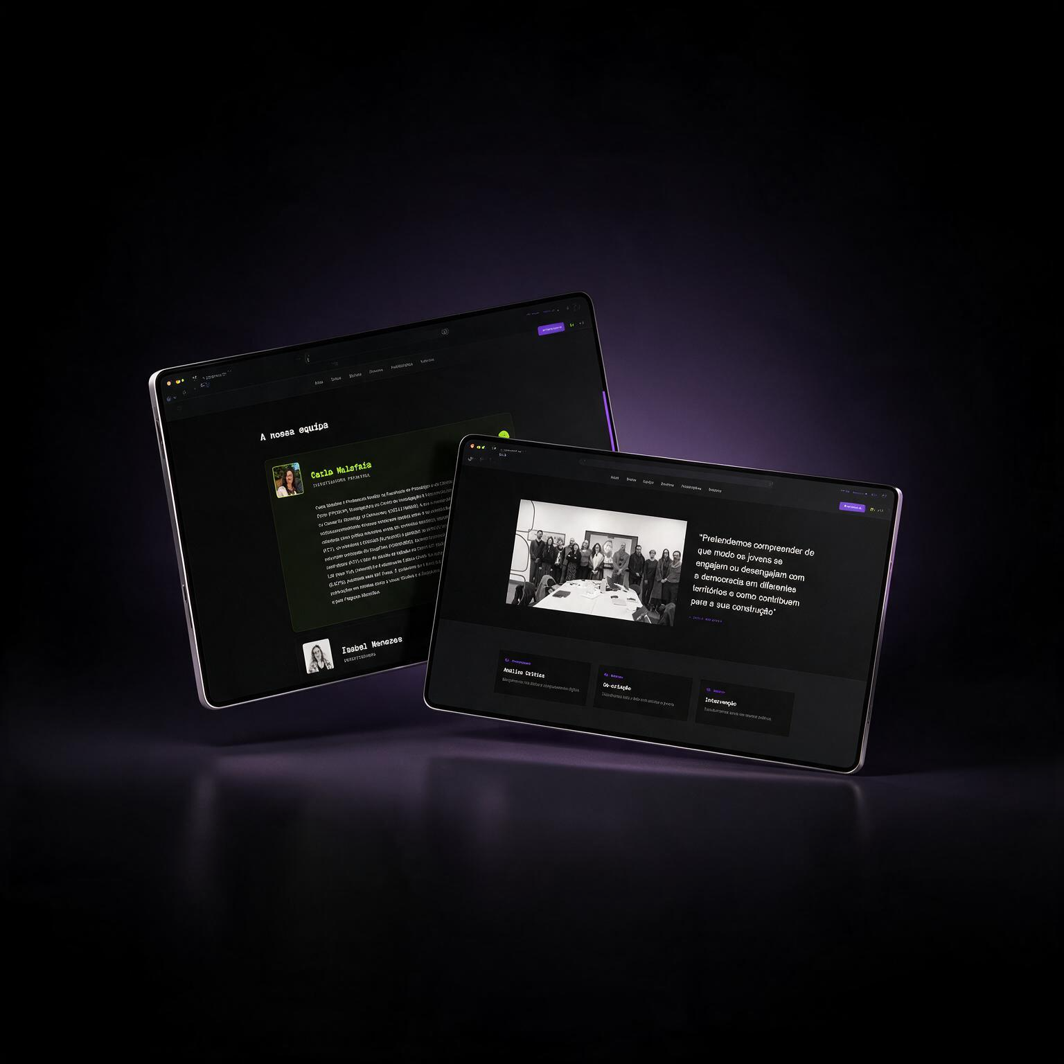
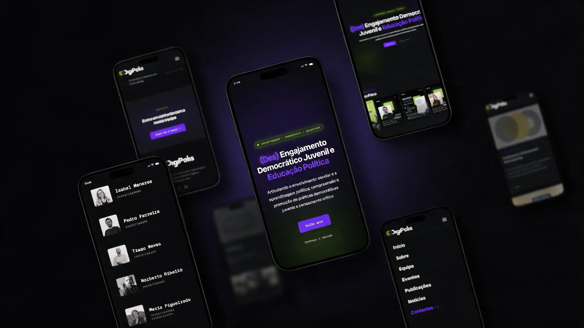
Building the digital foundation of a European research project.
EDigiPolis is a university research project that uses AI to map political engagement across social media, tracking how hashtag activity spreads and clusters around two major regions in Portugal — Porto and Viseu. I designed the brand identity and the 7-page website that presents the research to the public, academic partners, and future participants.
The research maps something invisible — political engagement doesn't leave a paper trail, it leaves a hashtag trail.
That was the starting point for the identity: if the method is about tracing signals across a network, the brand needed to look and feel like a signal being tracked, not like a typical academic microsite. Every decision — the logo, the colour palette, the way text and data are presented on the site — comes back to that one idea: this is a project about mapping connections, not just publishing a report.
Three dots, three cities
The research isn't confined to one place. The two regions being mapped — Porto and Viseu — are the subject of the study, but the research team's work is spread across three cities: Porto, Helsinki, and Viseu. The logo marks all three as connected nodes — a small network, rather than a single institutional crest.
A digital foundation, built from zero
Designing and developing the first digital platform for EDigiPolis, transforming a newly funded research initiative into an accessible, scalable and future-ready digital experience.
Role
Creative Strategy · UX/UI Design · Information Architecture · Front-end Development · WordPress
EDigiPolis is a European research project investigating youth democratic engagement and political education through digital tools. When the project was funded, there was no digital presence, no website and no structured communication platform. The challenge was to design and build a scalable digital ecosystem capable of supporting the project's communication throughout its entire lifecycle.
Purple for technology, green for signal
The palette leans on two colours doing two different jobs. Purple carries the "AI / research" side of the project — it reads as technical and a little synthetic, without tipping into generic corporate-tech blue. Green is the signal colour: a nod to radar and old radio-wave displays, chosen because the research itself is a kind of radar — sweeping social media for signals of engagement and plotting where they cluster.
The identity in use
How the mark and palette carry across formats — from the browser tab to social presence.




A 7-page system, carrying the identity through
Home, About, Team, Events, Publications, News and Contact — each page needed to feel credible to academic partners while staying visually tied to the network-mapping concept above.
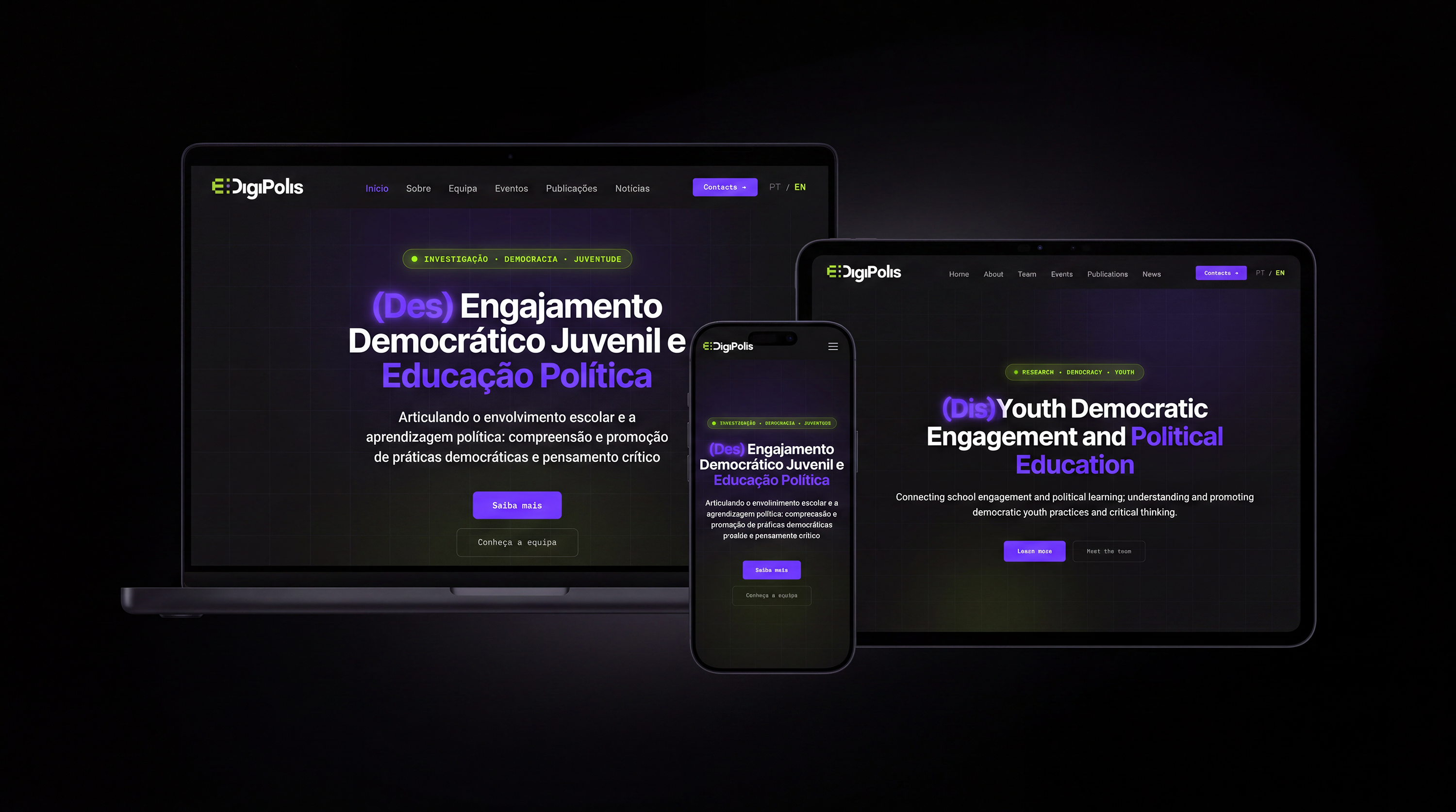
Project phases, numbered 01 — 04
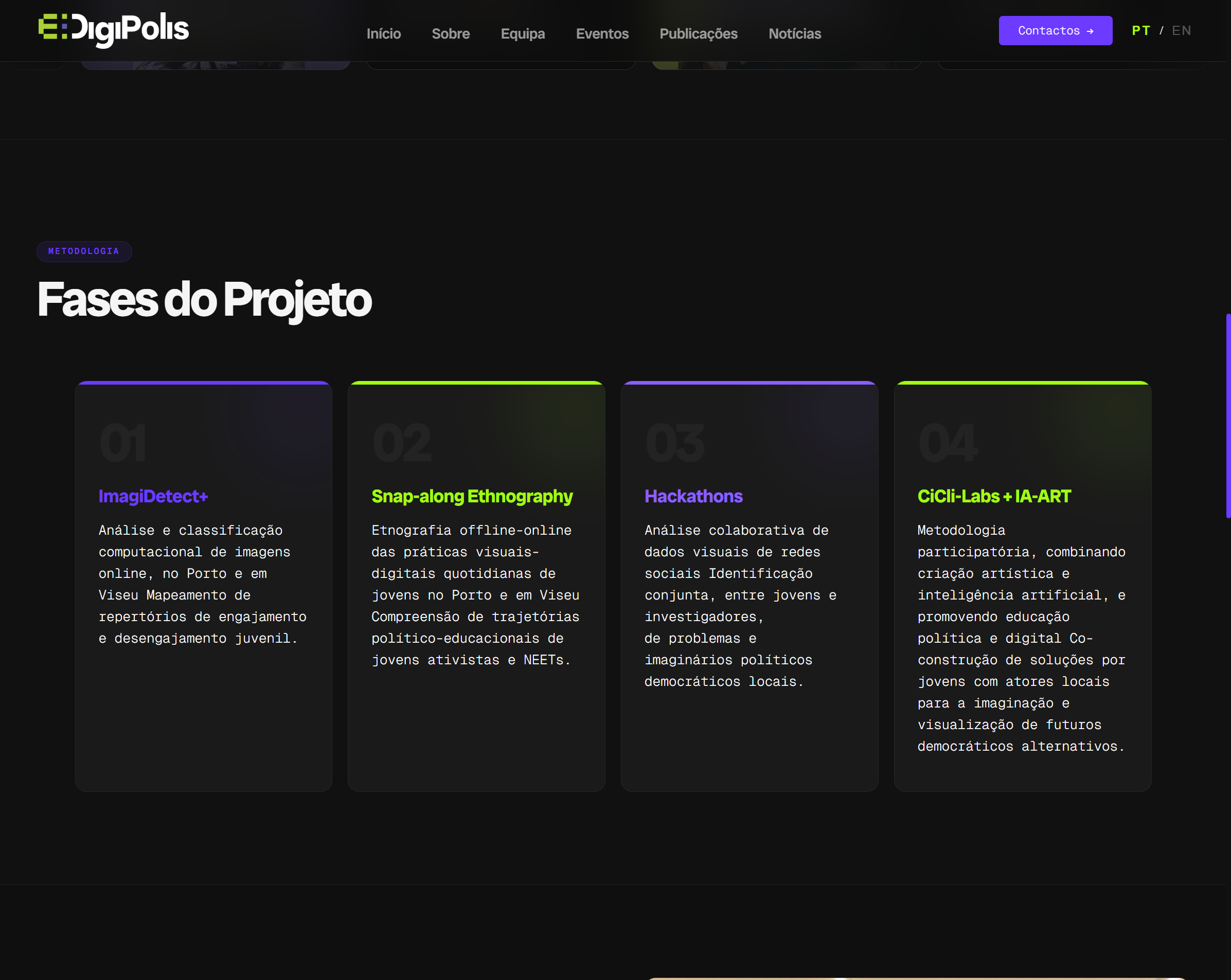
The homepage breaks the research methodology into four numbered stages — ImagiDetect+, Snap-along Ethnography, Hackathons, and CiCli-Labs + IA-ART. Turning an academic methodology into a scannable, step-by-step system was one of the core design problems on this project.
A 7-page system, not a single landing page
Each section carries the same visual language across the full site — About, Team, Events, Publications, and News.